


Sometimes I think that designers, in any field, are slaves to trend. Like a wave in the distance, we see a trend emerging. It’s irresistibly headed our way, and before too long we are implementing it in our work for better or for worse. One minute it’s all about grey tones, the next everything needs to show a bird or look like an app. It’s actually important though: trend spotting and application helps our clients feel relevant.

The past decade has seen a major trend for brands of all kinds using sans serif typefaces. Sans serifs are the ones like Arial which have a simplified look compared to serif typefaces like Times. Sans serifs can be used to convey a sense of ‘modernity’, elegance, smarts and openness, so it’s no wonder brands from Google and Facebook to almost every major bank present with them. Some of those businesses might need more than a sans serif typeface to rebuild their brand perception, but I guess it’s worth a try!
Of course, serif fonts have continued to be used, but not generally for redefining a major brand, with very few exceptions. However, in the past year or so serifs have become more prevalent for non-mainstream brands, who are looking to differentiate themselves and create a more considered sense of personality. This leads me to feel that the time is ripe for a major brand to set the pace by using a serif typeface for their primary mark, in a way that feels contemporary and on-tech. (Perhaps I missed one? If I did, let me know.)
Bucking the trend, a highly visible industry which has embraced serif fonts for big brands, is real estate development. Most off-the-plan developments, in Melbourne and Australia at least, use serif fonts with strong personality. They connote a sense of home, but also of luxury and personal attention, which is much harder to do with sans serif fonts. The better examples of this also manage to feel contemporary and somehow tech-savvy.
Blanding: how most brands became alike
Since the design of the all-conquering, perennial sans serif typeface, Helvetica in the 1950s, sans serif, serif, script and other type styles were widely used for all kinds of brands. Apple and Google both started out with distinctive serif logotypes. But now, in the current tech era, brand after brand has cut the serifs and scripts to try to look simpler and more approachable, seeming to indicate that serif fonts feel old-fashioned and condescending – a tone which they can sometimes have.

Beyond the initial push for chunky sans serif logos in the 1960s and 70s (think Mobil or Target), I place the start of the current san serif logo trend at the rebrand of Airbnb in 2014 (great article here). Their original logo used a quirky script font (I hate it but it has personality), which was swapped for friendly feeling, geometric sans serif lettering. Google, MailChimp, Lenovo and many other tech brands followed to the point where it’s now hard to spot a serif. Many brands in many other industries have gone the same way, including Mastercard and Uber, defining the current era by friendly feeling, geometrics sans serif brands.
And now everything looks the same.
That is not good if you think that marketing and design should help build desire. Desire is about what the audience thinks they need. People think they need what they don’t have. What they don’t have is something different. But all these brands look the same and have the same tone of voice through typography. This phenomena is sometimes called ‘blanding’ (read about that here). But wait a minute, my last name is Bland! Anywho…
Returning to serif typefaces?
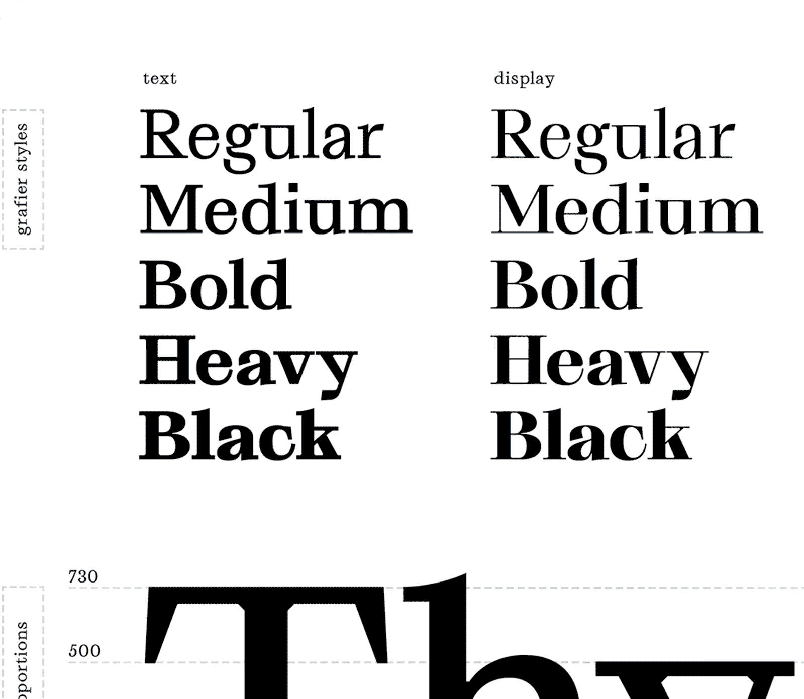
Contemporary serif typefaces express all kinds of nuanced emotions and connotations. My current favs include Grafier, Happy Times at the IKOB, Domaine and Droulers. I’d love to see a major, tech-forward business use these kinds of serif typefaces for their primary branding. A move like this has the potential to set the scene for the next trend cycle and bring unique, memorable and human personality to the brand.
At Univers we have presented serif font options on some brand projects over the last year, hoping a client would be brave enough to get it. But no serifs where taken up by our clients.
One reason is the brands we work with tend to be smaller. They’re unlikely to set a trend and it’s risky for them to look out of touch. Another reason is that our clients and presumably their audiences, just want that meaning which sans serif typefaces currently signal: a sense of current technology and being contemporary and open.
This is unlikely to change while all mainstream tech-forward brands use sans serif branding. But if that ever changes, we can expect to see a new wave of serif logotypes lending their distinctive voice to brands. Surely that trend will happen soon, and 2019 could turn out to be the year it dropped.