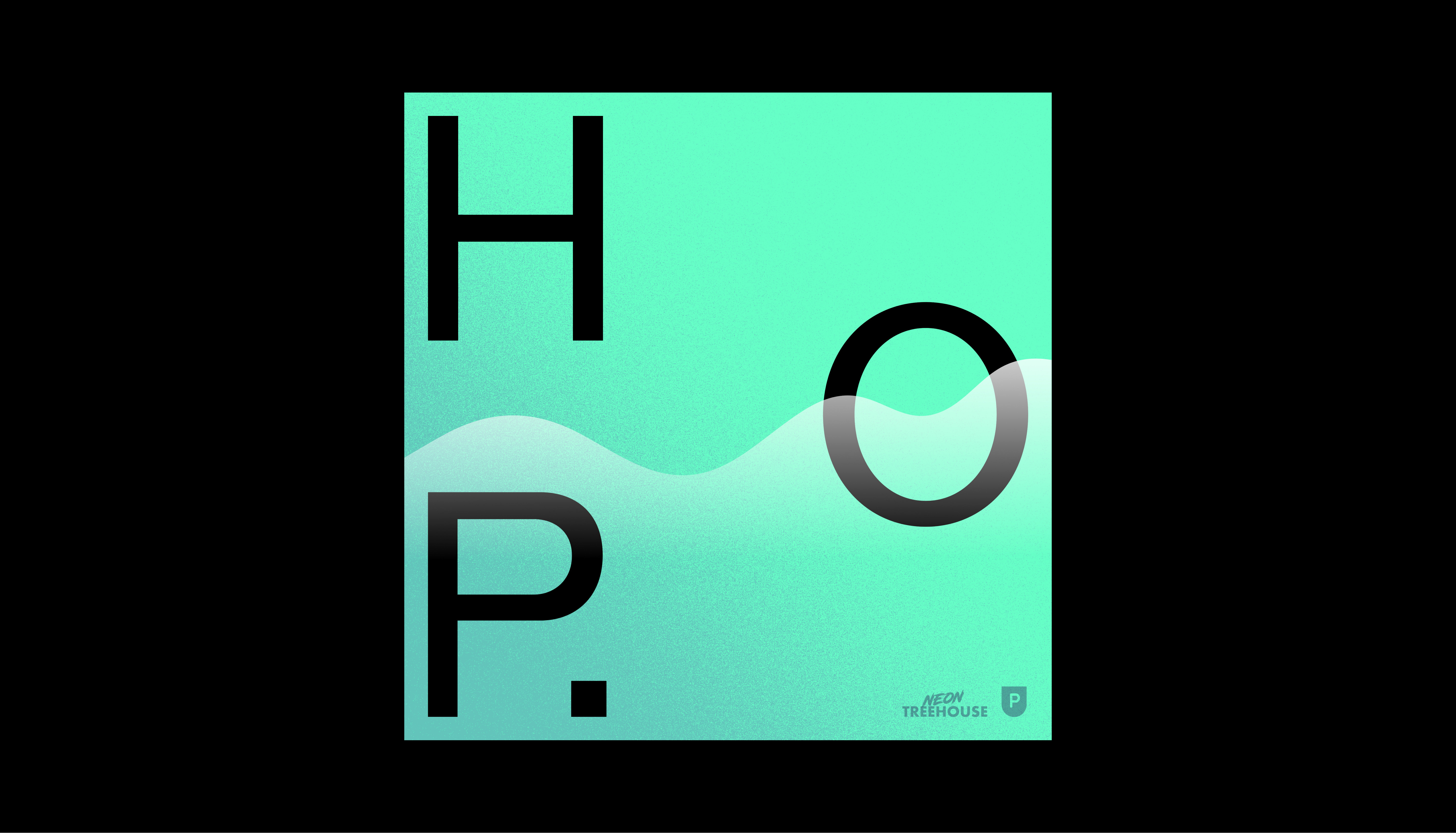
Based on our research, we knew the most successful podcast cover art was dead simple; one typeface and two colours max, and if they had any other elements, they were very rudimentary illustrations or shapes.
With these limitations in mind, we first concentrated on how best to display the name for this format. Since all podcast apps display the name in conjunction with the cover art, we figured we could get away with abbreviating the name down to just ‘HOP’ without negatively impacting user experience or brand recognition.
Once the acronym logotype was locked in, we created a supporting device that could be used with the logotype or in solitude. Our exploration led us to ‘The Wave’; a graphical device derived from a sound wave that also loosely references & looks like snow-capped mountains or ocean waves.
The Wave represents the ebbs and flows or the journey someone takes in finding their purpose. From the get-go, we considered how this graphical device could animate & bring motion to HOPs identity, in addition to the various forms it could take across many of the brand touchpoints (such as social banners, & website).


